Use different report types to look at data in different ways or to answer different business questions. For example, you create a list report to show your entire customer base, and you create a crosstab report to show the quantity of units sold broken down by product line and country. You can create a chart to present data graphically.
In Query Studio, you can create the following report types:
You can also combine a chart with either a list report or a crosstab report.
Use list reports to show columns of information, such as product lists or customer lists.
A list report shows data in rows and columns. You can apply a filter, summary, or calculation to manipulate the data that appears in the report.
By default, Query Studio automatically suppresses duplicates,
summarizes detail values, and generates footer summaries for measures.
You can change these defaults  .
.
By default, Query Studio builds list reports when you create a report from scratch. You can try creating a list report yourself.
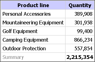
You are a report author at the Great Outdoors Company, which sells sporting equipment. You are requested to create a report that shows the quantity of units sold for each product line in all countries. You can retrieve this information using a list report.
Before you can try this example, you must set up the sample packages that come with Cognos 8. For more information, see the Administration and Security Guide.
In the Cognos Connection home page, click the Public Folders tab.
All available packages appear.
Click the GO Data Warehouse (query) package.
From the Launch menu, click the Query
Studio link  .
.
Query Studio opens, and the GO Data Warehouse (query) query items appear in the left pane.
Expand Sales and Marketing (query).
Expand Sales (query).
Expand Product.
Double-click the Product line item.
Expand Sales fact.
Double-click the Quantity item.
By default, the report item heading uses the name of the underlying item in the data source. You can also add a descriptive title to the report.
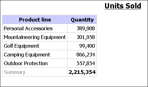
At the top of the report, click the Title link.
In the Title box, type
Units Sold
Click OK.
You now have a titled report listing the units sold for every product line.
Click the save button  on
the toolbar.
on
the toolbar.
In the Name box, type
Units Sold
Leave the default destination folder as Public Folders, and click OK.
A simple list report that contains columns of unique values is easy to understand. However, after you add more columns, you may find that duplicate values appear in your report.
Grouping a report sorts the data and suppresses duplicate values in the grouped column. For example, a report contains information about the quantity of units sold, in columns named Product line, Country, and Quantity. Each product line is sold in more than one country, so the same product line value appears in multiple rows in the Product line column.
You group by product line to
suppress duplicate values of the product line report item
sort the product lines alphabetically
generate footer summaries for each product line
For more information, see Group Identical Values. You can try creating a grouped report yourself.
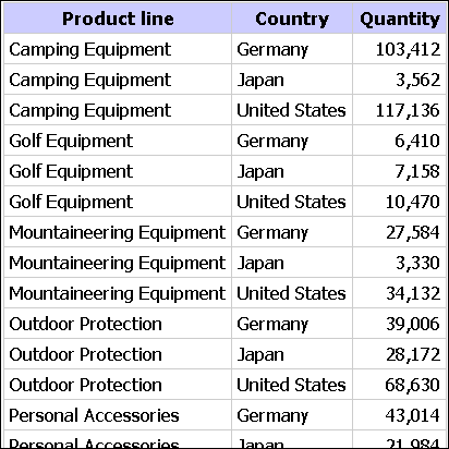
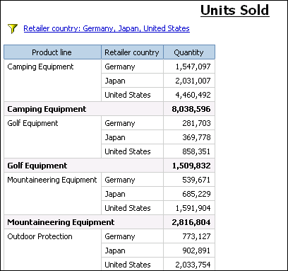
You are a report author at the Great Outdoors Company, which sells sporting equipment. You are requested to create a report that shows the quantity of units sold for each product line in three specific countries. You reuse a list report that already contains some of the necessary data, and add another column.
At first, your report shows the total quantity of units sold for all product lines in all countries. You apply a filter to the Country column and group by product line to suppress the duplicate values in the Product line column.
Before you can try this example, you must set up the sample packages that come with Cognos 8. For more information, see the Administration and Security Guide.
You must also have created the example list report .
Open the Units Sold report.
Click the heading of the Quantity column.
Click the Insert Data menu command.
Expand Sales and Marketing (query).
Expand Sales (query).
Expand Retailer site.
Double-click the Retailer country item.
A column appears that represents this item, to the left of the Quantity column. You now have a report listing the quantity of units sold for every product line in all countries. However, you are interested only in the quantity of units sold in three specific countries. Apply a filter to include only the countries you want.
Click the heading of the Retailer country column.
Click the filter button  on
the toolbar.
on
the toolbar.
In the Show only the following box, click Germany, Japan, and United States, and then click OK.
By default, the filters appear in the subtitle.
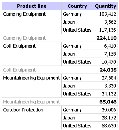
You can group by product line to suppress the duplicate values in the Product line column.
Click the heading of the Product line column.
Click the group button  on
the toolbar.
on
the toolbar.
The values in the Product line column are sorted alphabetically, and duplicate values are removed.
Click the save as  button
on the toolbar.
button
on the toolbar.
In the Name box, type
Grouped Units Sold
Leave the destination folder as Public Folders, and click OK.
A crosstab report shows a measure at the intersection of each row and column. This is useful for showing more information in a smaller area. For example, if a report shows Product line as columns, Country as rows, and Quantity as the measure, the value at the intersection of each column and row shows the quantity of units sold for that product line and that country.
You can try creating a crosstab report yourself.
Use a crosstab report to show summary information. For example, you create a crosstab report to show quantity of units sold by product line for each country.
Like list reports, crosstab reports show data in rows and columns. However, the values at the intersection points of rows and columns show summarized information rather than detailed information.
Open the report that you want in Query Studio.
Click the heading of the report item you want to use as the top row.
Click the pivot button  on
the toolbar.
on
the toolbar.
The values of the selected report item are now column headings. The other report items become row headings, and the measure is now at the intersection of the two.
Tip: To change the crosstab report back to a list report,
click the top row, and then click the ungroup button  on the toolbar.
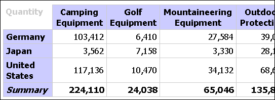
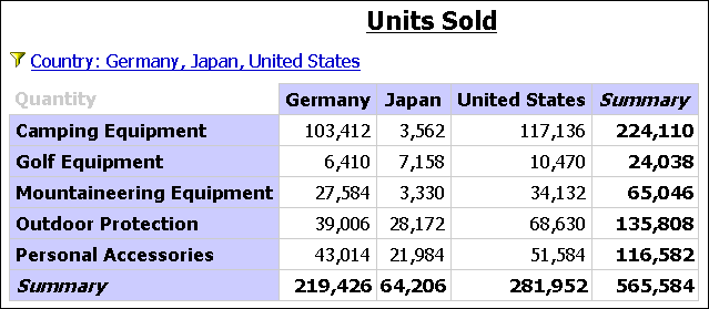
You are a report author at the Great Outdoors Company, which sells sporting equipment. You are requested to create a report that shows the quantity of units sold for each product line in three specific countries. You reuse the grouped report that already contains the necessary data, and change the layout for improved analysis.
Before you can try this example, you must set up the sample packages that come with Cognos 8. For more information, see the Administration and Security Guide.
You must also have created the example grouped list report .
Open the Grouped Units Sold report.
Click the heading of the Retailer country column.
Click the pivot button on
the toolbar.
The values of the Country column are now column headings. The values of the Product line column become row headings. The measure is at the intersection of the two.
Click the save as button on
the toolbar.
In the Name box, type
Crosstab Units Sold
Leave the destination folder as Public Folders, and click OK.
Use charts to present information graphically.
A report requires at least one measure and one non-measure to produce a chart. Measures are quantitative data, such as figures for sales, costs, and quantities. Non-measures are qualitative data, such as names, addresses, and countries.
How the data is plotted depends on the chart type. The maximum number of non-measures is two. You can plot any number of measures in a report. However, a chart that has more than four or five measures is difficult to understand.
Query Studio charts plot the most summarized data in the report.
Focus the chart by eliminating unnecessary measures from your report
and reordering the columns so that the most significant non-measures
are in the outer levels of nesting.
For more information, see Chart Types.
Use charts to see patterns and trends in data. For example, you can see how actual sales compare to projected sales, or whether sales are falling or rising over quarterly periods.
You can show just the chart, or the chart with the table appearing under the chart.
Open the report that you want in Query Studio.
Reorder report items, if necessary.
Click the chart button  on
the toolbar.
on
the toolbar.
In the Chart type box, click a chart style.
Click a chart configuration.
If you want to view only the chart, click Chart only.
If you want the values to appear on the chart, select the Show the values on the chart check box.
Click OK.
Tip: To remove a chart, click the chart button on the toolbar, and then in the Chart dialog box, click None.
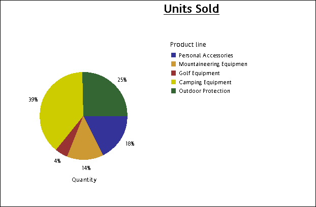
You are a report author at the Great Outdoors Company, which sells sporting equipment. You are requested to create a chart that illustrates the relative contribution each product line makes to the quantity of units sold. You reuse the units sold report to create a pie chart that emphasizes the percentage contribution of each product line.
When the focus of a report is actual values, and not relative contribution, create a column chart.
Before you can try this example, you must set up the sample packages that come with Cognos 8. For more information, see the Administration and Security Guide.
You must already have created the example report for sales .
Open the Units Sold report.
Click the chart button on
the toolbar.
In the Chart type box, click Pie.
Click 100 Percent.
Select the Show the values on the chart check box.
In Show the following in the report, click Chart only, and then click OK.
Click the save as button on
the toolbar.
In the Name box, type
Units Sold Pie
Leave the destination folder as Public Folders, and then click OK.
You can download a chart onto your computer. This is useful when you want to send the chart to someone else or view the chart at a later time.
In Cognos Connection, navigate to the report you want.
Under Actions, click Run
with options  .
.
In the Format box, click HTML.
You can download a chart only if the report is run in HTML format.
Click Run.
The report runs in Cognos Viewer.
Right-click the chart you want to download to your computer and click Download Chart.
Click Save and choose the location where you want to save the chart.
The chart is saved as a Portable Network Graphics (.png) file.
