Charts are a graphical way of presenting information. Use charts to reveal trends and relationships that are not evident in tabular reports. For example, you can create a chart to visualize how actual sales compare to projected sales, or to discover whether sales are falling or rising over quarterly periods.
You can also drill up and drill down  on charts.
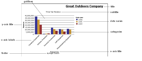
Charts plot the crosstab rows as the data series. Nested rows appear as joined items in the legend. Stacked rows appear sequentially in the legend.
Charts plot the crosstab columns on the x-axis. Nested columns are clustered on the x-axis. Stacked columns are plotted sequentially on the x-axis.
Charts plot a single measure on the y-axis.
If you have the necessary permissions, you can enhance your chart in Report Studio. You can change the appearance of the columns, lines, and areas; add notes and baselines; or customize the chart properties to present the chart more effectively. For more information, see the Report Studio User Guide.
Tip: To open your chart in Report Studio, from the File menu, click Open in Report Studio.
Note: If you make and save changes to an Analysis Studio chart in Report Studio, the chart can no longer be opened in Analysis Studio.
For information about charts, see Chart Types.
When you pause the pointer over the hotspots of a chart, visual
elements appear, such as tooltips and the plus sign (+) and caret  that indicate drill-up/down ability.
The response time for showing a chart increases as the number of hotspots increases. The administrator can configure Analysis Studio to limit the number of hotspots returned to provide improved performance.
Prioritization is given to generating hotspots for items such as axis labels and legend labels before individual graphical elements such as bars, pie slices, and so on. Depending on the number of items in a chart and the current setting for the maximum number of hotspots, some axis items may have hotspots while other axis items and all graphical elements do not, or all axis items and some graphical elements may have hotspots while other graphical elements do not.
With the crosstab open, click the chart button  on the toolbar.
Click the chart type you want.
You can also choose
whether to use a different grouping type, if available
whether to show the values on the chart
whether to give the chart a 3-D visual effect
Tip: You can use the display button  on the toolbar to show only the chart,
only the crosstab, or both.
on the toolbar to show only the chart,
only the crosstab, or both.
