Charts are a graphical way of presenting data. For example, you can create a chart to visualize how actual sales compare to projected sales, or to discover whether sales are falling or rising over quarterly periods.
Some chart types are not supported for Microsoft Excel output, or appear differently. For more information, see Producing Reports in Microsoft Excel Format
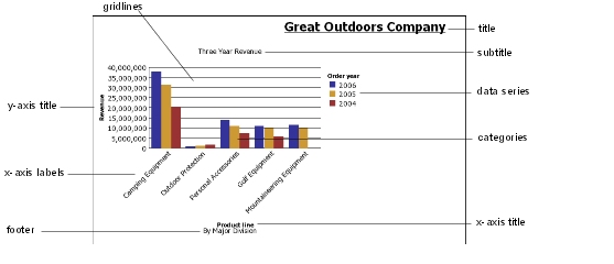
This column chart shows the most common chart elements. You can add extra elements such as baselines and notes using Report Studio.
Axes are lines that provide a frame of reference for measurement or comparison.
The y-axis refers to measures of quantitative data, such as sales figures or quantities. Charts may have more than one y-axis.
The x-axis or ordinal axis plots qualitative data, such as products or regions. It runs horizontally, except in bar charts.
The z-axis is the vertical axis in a 3-D chart.
Axes are lines that provide a frame of reference for measurement or comparison. Major gridlines extend from the tick marks on an axis and run behind the data markers.
A data series is a group of related data points plotted in a chart. Each series has a unique color or pattern and is described in the legend.
In the example chart, the data series are order years 2004, 2005, and 2006.
A legend is a key to the patterns or colors assigned to the data series or categories in a chart.
Categories are groups of related data from the data series, plotted on the x-axis. Categories of multiple data series are shown together using clustered and stacked data markers.
In the example chart, the categories are the product lines of The Great Outdoors Company, in clustered columns.
Charts use columns, lines, and areas as visual representations of data points. Other examples of visual representations include horizontal bars, points, and bubbles.
